I go to Lancaster quite regularly. The beer is better there than Preston, where people have drowned in the ocean of Thwaites Wainwright that washes around there. If I can't be arsed with the Stagecoach #41 Bus Of Evil, I go on the train. This is the window of the second nearest pub to to Lancaster Train Station :
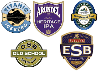
They do a decent pint of Hydes Original (no small feat), and have a fridge full of BrewDog. But why have they a windowful of 400-point Copperplate Gothic? I presume they have used the same graphic designer as this geographically wide spread of pumpclips :
Is there something I'm missing here? Is is about to become legally compulsory that to operate as a licenced premises, you have to have all signage in Copperplate Gothic? I suppose it's better than the Helvetica we had back in the 1980s, or the Willow or Exocet we suffered back in 2000, but there are few things more scary than living in a one-typeface world.
There are thousands of decent fonts in the world. Surely breweries can insist on using another one of them occasionally?
Thankfully, The Tap House in Lancaster is a haven of Palatino. My advice is to never learn about typefaces. It will only cause you irritation in the end...


No comments:
Post a Comment